PeerIndex is now part of Brandwatch
Together we have created Brandwatch Audiences.
Great marketing starts with understanding your audience.
Discover instant audience intelligence powered by the largest influencer database of its kind.
Join the thousands of companies using Brandwatch Audiences. Learn what Brandwatch can tell you about your customers. Complete the form to book your meeting and we’ll be happy to show you.
Why Audiences:
-
Leader in G2Crowd Social Media Monitoring
-
Official Twitter Partner
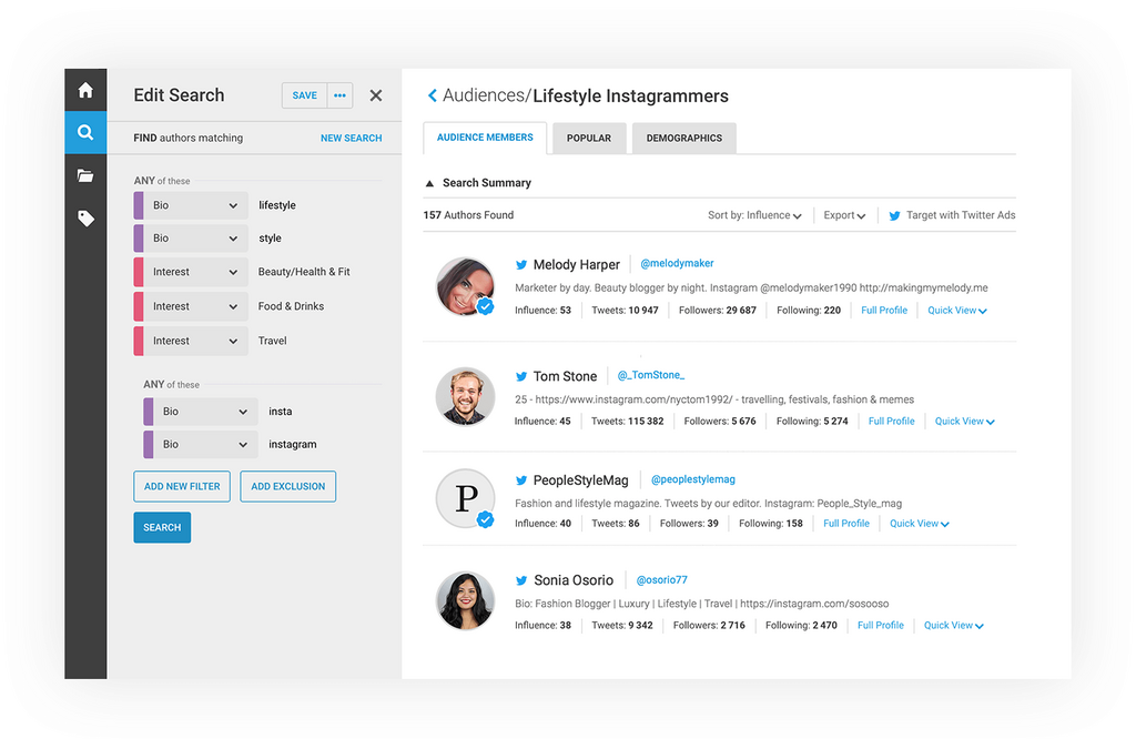
Find the people that matter
Explore the largest database of Twitter users of its kind to find and understand the communities that matter to you.
Locate and curate your audience based on interests, demographics, location, profession, and much more.
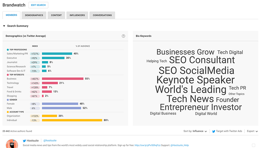
Understand your audience
Get instant insights into what your audience is passionate about, which topics dominate conversation, and what content drives engagement.
Compare your audience against your competitors or different audiences to understand what makes them unique.

Harness the power of influence
Look beyond follower numbers to find the up-and-coming, everyday influencers who hold the ability to reach the right audience.
Our unique influence scoring helps you identify people who generate real engagement, not just those with large followings.
